Grouped display
Kevin Liu
5/17/2020
Just a pratice using matplotlib.
1 R lattice
library(lattice)
dotplot(variety ~ yield | site, barley,
        layout = c(1, 6), aspect = c(0.7),
        groups = year, auto.key = list(space = "right"))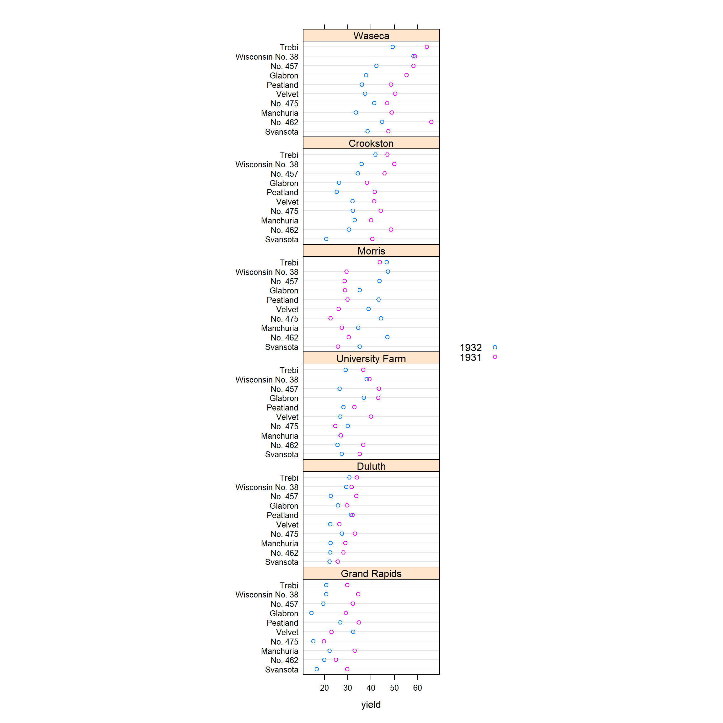
2 Python matplotlib
import numpy as np
import pandas as pd
import matplotlib.pyplot as plt
df1 = r.barley

site_list = df1.site.unique()
year_list = df1.year.unique()
n = 1
plt.figure()
for i in site_list:
  for j in year_list:
    index1 = (df1.site == i) & (df1.year == j)
    df_temp = df1.loc[index1,]
    y = list(df_temp["variety"])
    x = list(df_temp["yield"])
    plt.subplot(610 + n)
    if j == "1931":
      plt.plot(x, y,'bo',label = j)
    if j == "1932":
      plt.plot(x, y,'r+',label = j)
    ax = plt.axis(xmin = 10, xmax = 70)
    if n == 1:
      plt.legend()
    plt.title(i)
    plt.grid(True,axis='y')
  n = n + 1
plt.subplots_adjust(hspace=0.5)
plt.show()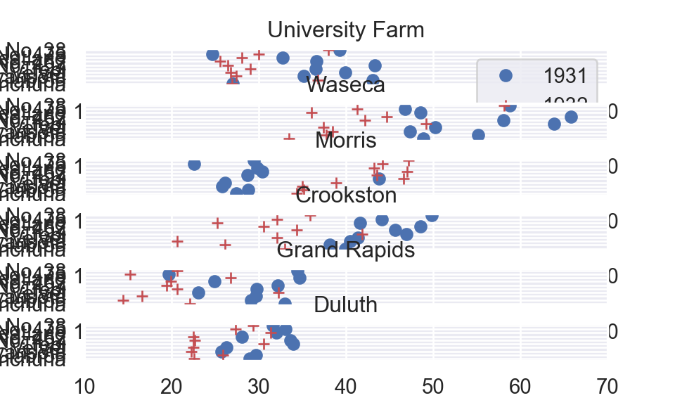
plt.close()References
Sarkar (2008)
Sarkar, Deepayan. 2008. Lattice: Multivariate Data Visualization with r. New York: Springer. http://lmdvr.r-forge.r-project.org.